While these economic shifts are positive, it’s the other end of the global wealth spectrum that attracts the most attention. A high degree of wealth creation is amassed by those at the top of the economic pyramid.
The Top-Heavy Wealth Spectrum
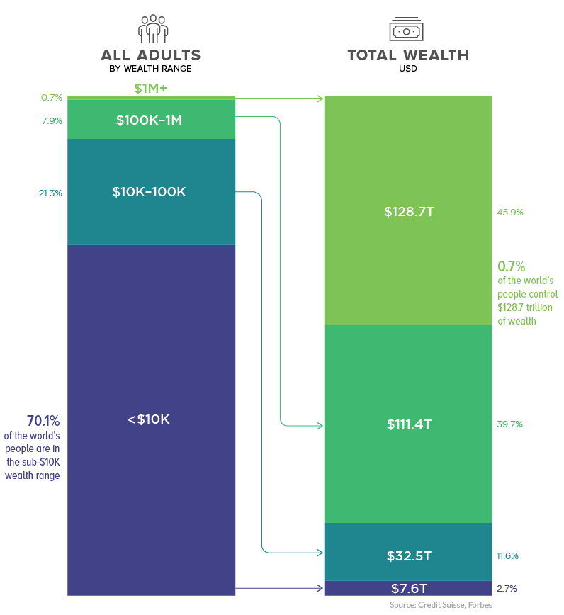
Today, slightly less than 1% of the world’s adult population occupies the $1M+ wealth range. Despite their small numbers, this elite group collectively controls 46% of the world’s wealth, valued at approximately $129 trillion.
On the flip side of the equation, 70% of world’s population fall into the sub-$10K wealth band. This majority of people around the world collectively control a mere 2.7% of the world’s wealth. Even as “the rich get richer”, there is good news for the majority. The percentage of people in that lowest wealth band has been shrinking over the years.
Moneyed Metropolises
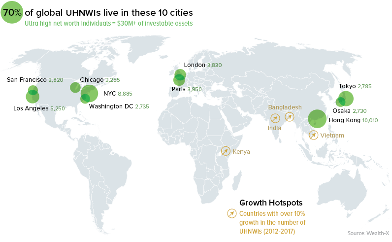
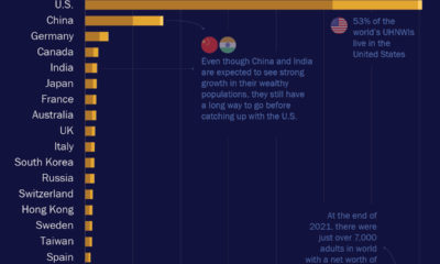
Not only is money concentrated among a small portion of the population, those people tend to gravitate towards global cities such as London, Hong Kong, and New York. In fact, 70% of ultra high net worth individuals (UHNWIs) – persons with investable assets of $30 million or more – reside in just ten cities around the world.
According to Credit Suisse, emerging markets now account for 22% of growth in the UHNWIs category – up from just 6% growth in 2000 – with China alone adding over 16,000 UHNWIs to the mix. Many members of this elite class may generate their wealth in emerging economies around the world, but as we can see from the map above, the world’s richest people end up very concentrated, geographically speaking.
Global Wealth, by Continent
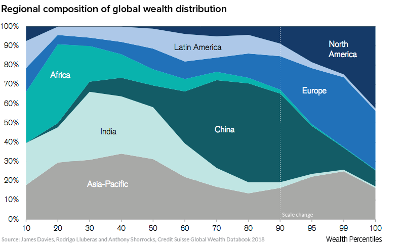
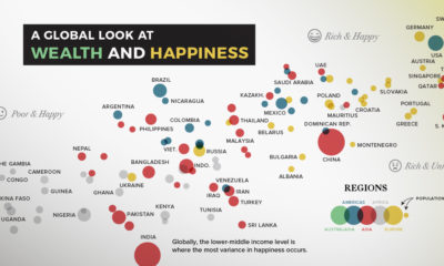
As the visualization below demonstrates, wealth accumulates in Europe and North America. This trend is so pronounced that it only becomes evident once the scale is adjusted to see the detail in the upper percentiles.
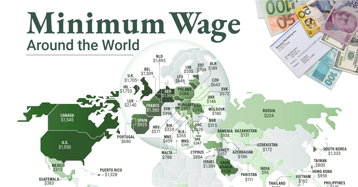
One thing is for certain – the world is changing quickly, and just as this graph would have looked very different 20 years ago, global wealth will almost certainly look different in 20 years time. on To see how the minimum wage differs around the world, we’ve visualized data from Picodi, which includes values for 67 countries as of January 2023.
Monthly Minimum Wage, by Country
The following table includes all of the data used in this infographic. Each value represents the monthly minimum wage a full-time worker would receive in each country. Picodi states that these figures are net of taxes and have been converted to USD. Generally speaking, developed countries have a higher cost of living, and thus require a higher minimum wage. Two outliers in this dataset are Argentina and Turkey, which have increased their minimum wages by 100% or more from January 2022 levels. Turkey is suffering from an ongoing currency crisis, with the lira losing over 40% of its value in 2021. Prices of basic goods have increased considerably as the Turkish lira continues to plummet. In fact, a 2022 survey found that 70% of people in Turkey were struggling to pay for food. Argentina, South America’s second-biggest economy, is also suffering from very high inflation. In response, the country announced three minimum wage increases throughout 2022.
Minimum Wage in the U.S.
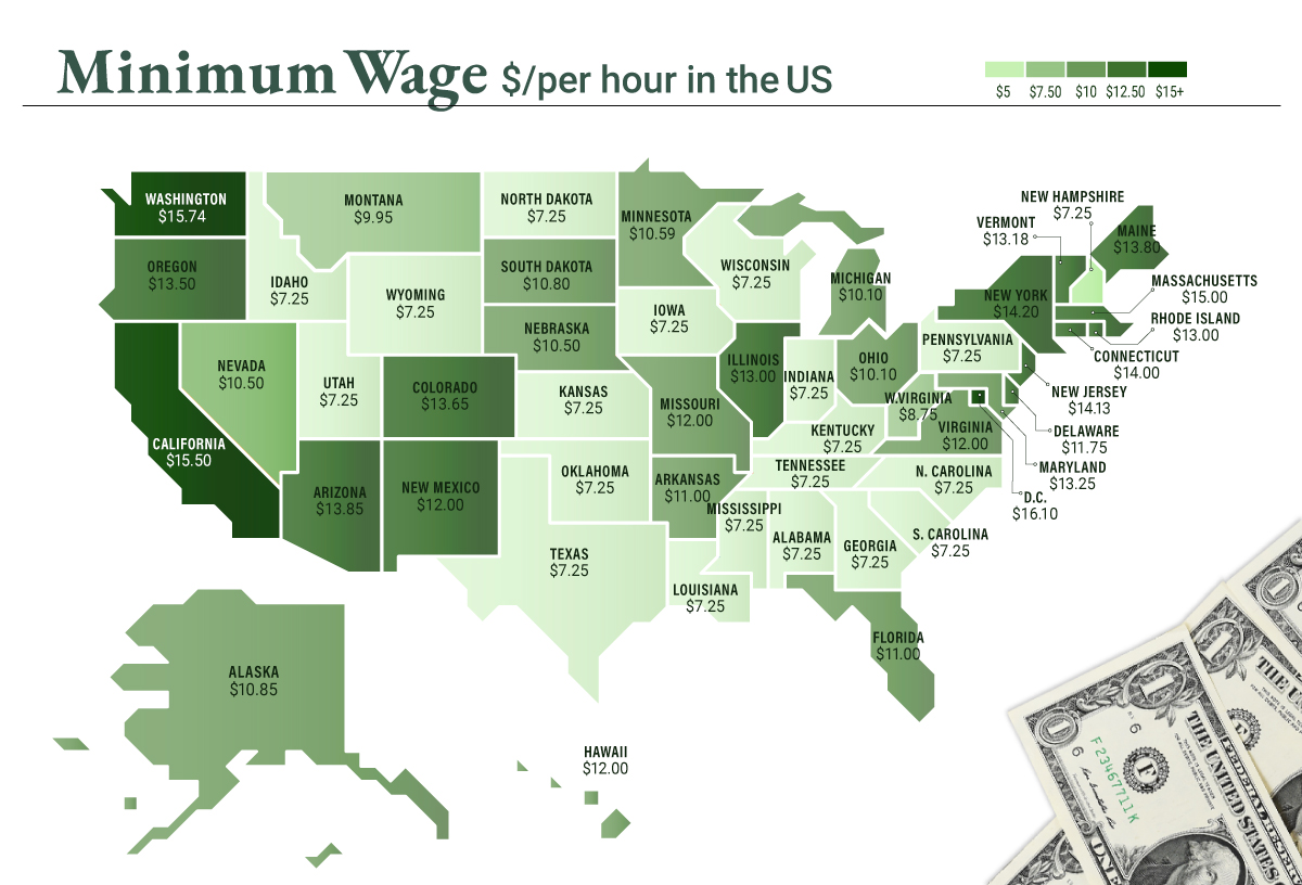
Within the U.S., minimum wage varies significantly by state. We’ve visualized each state’s basic minimum rate (hourly) using January 2023 data from the U.S. Department of Labor.
2023-03-17 Update: This map was updated to fix several incorrect values. We apologize for any confusion this may have caused. America’s federal minimum wage has remained unchanged since 2009 at $7.25 per hour. Each state is allowed to set their own minimum wage, as long as it’s higher than the federal minimum. In states that do not set their own minimum, the federal minimum applies. If we assume someone works 40 hours a week, the federal minimum wage of $7.25 translates to an annual figure of just $15,080 before taxes. California’s minimum wage of $15.50 translates to $32,240 before taxes. For further perspective, check out our 2022 infographic on the salary needed to buy a home across 50 U.S. cities.
