In this visual we’ve ranked the economic output of the top 15 U.S. cities from New York City to Minneapolis, using data from the U.S. Bureau of Economic Analysis. The data covers 2021, which is the most recent release from BEA. It’s important to note that the data considers entire surrounding metropolitan areas, so as an example, New York City includes neighboring population centers such as Newark, NJ, as well as Jersey City—reaching a GDP of nearly $2 trillion. Measuring a city’s economy at the metro level can provide a more accurate representation of its economic activity. This is because the metropolitan areas include not only the central city but also the surrounding suburban and rural areas that are economically connected to it.
America’s Economic Hubs
There are some obvious winners when it comes to the largest U.S. cities by GDP, including NYC, Los Angeles, Dallas, and San Francisco. In the table below, we’ve listed each of the 384 metropolitan areas out of the dataset all the way down to last place, Sebring-Avon Park, Florida, alongside respective ranks and GDP: As the graphic above makes obvious, NYC’s GDP towers over the rest. The Big Apple is the nerve center for a number of high-impact industries, including finance and media. Moving down the ranking, LA has a $1.1 trillion economy, followed by Chicago, with a GDP of just over $760 billion.
The Fastest Growing Cities
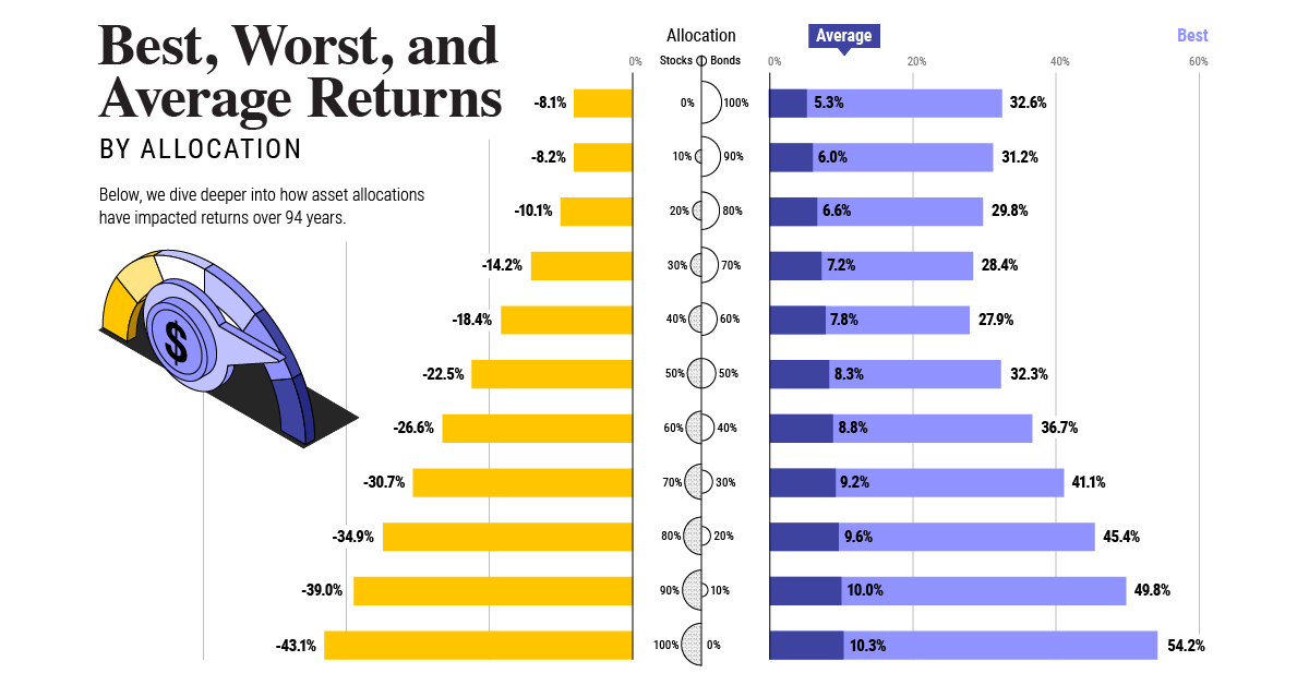
Although many of the top ranking cities are not surprising, there are a number of up-and-coming cities in the list. A report from the Kenan Institute, at the University of North Carolina’s Business School, reveals the fastest growing cities in the U.S. in terms of GDP growth year-over-year. Here’s a look at the top 10: San Francisco, Seattle, and Dallas appear on both the overall GDP size and growth lists. Dallas’ economy is driven in large part by a growing healthcare industry. The city also continues to attract talent being home to large companies AT&T, CBRE Group, and Texas Instruments. North Carolina is home to two of the fastest growing metropolitan areas, Raleigh-Durham and Charlotte. These cities may be ones to watch as they are becoming hubs of tech, research, and manufacturing. In fact, North Carolina was recently ranked as the most attractive U.S. state to do business in and both cities are among the fastest growing in terms of population. The economic center of gravity within the U.S. could be shifting away from the traditional centers of power towards booming cities in the South and West of the United States. The Kenan Institute found that the recovery of hospitality and leisure sectors has helped destinations in these regions like New Orleans and Orlando. Additionally, the shift towards high-tech industry jobs, remote work, and cheaper housing have made these cities very attractive. Of course, the sunny climate in these cities is an attractive selling point as well. on Last year, stock and bond returns tumbled after the Federal Reserve hiked interest rates at the fastest speed in 40 years. It was the first time in decades that both asset classes posted negative annual investment returns in tandem. Over four decades, this has happened 2.4% of the time across any 12-month rolling period. To look at how various stock and bond asset allocations have performed over history—and their broader correlations—the above graphic charts their best, worst, and average returns, using data from Vanguard.
How Has Asset Allocation Impacted Returns?
Based on data between 1926 and 2019, the table below looks at the spectrum of market returns of different asset allocations:
We can see that a portfolio made entirely of stocks returned 10.3% on average, the highest across all asset allocations. Of course, this came with wider return variance, hitting an annual low of -43% and a high of 54%.
A traditional 60/40 portfolio—which has lost its luster in recent years as low interest rates have led to lower bond returns—saw an average historical return of 8.8%. As interest rates have climbed in recent years, this may widen its appeal once again as bond returns may rise.
Meanwhile, a 100% bond portfolio averaged 5.3% in annual returns over the period. Bonds typically serve as a hedge against portfolio losses thanks to their typically negative historical correlation to stocks.
A Closer Look at Historical Correlations
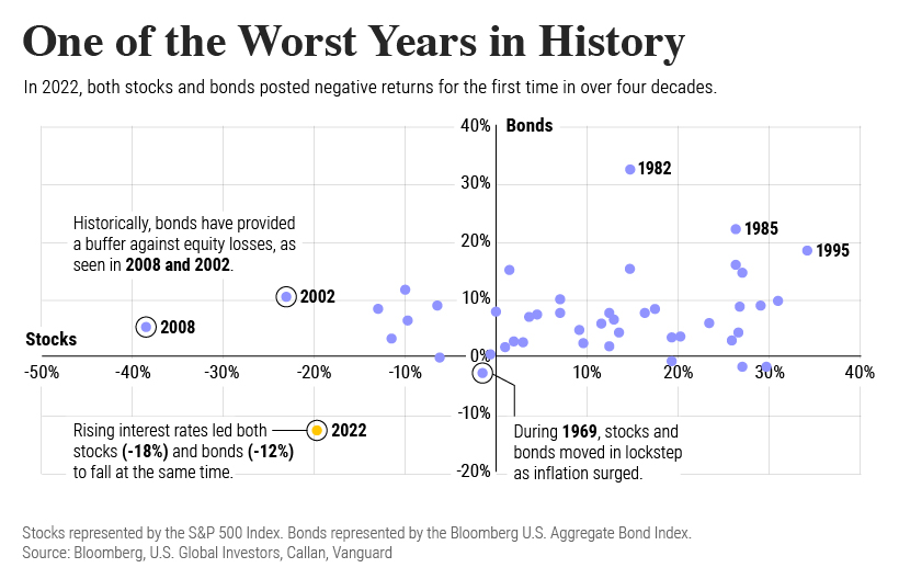
To understand how 2022 was an outlier in terms of asset correlations we can look at the graphic below:
The last time stocks and bonds moved together in a negative direction was in 1969. At the time, inflation was accelerating and the Fed was hiking interest rates to cool rising costs. In fact, historically, when inflation surges, stocks and bonds have often moved in similar directions. Underscoring this divergence is real interest rate volatility. When real interest rates are a driving force in the market, as we have seen in the last year, it hurts both stock and bond returns. This is because higher interest rates can reduce the future cash flows of these investments. Adding another layer is the level of risk appetite among investors. When the economic outlook is uncertain and interest rate volatility is high, investors are more likely to take risk off their portfolios and demand higher returns for taking on higher risk. This can push down equity and bond prices. On the other hand, if the economic outlook is positive, investors may be willing to take on more risk, in turn potentially boosting equity prices.
Current Investment Returns in Context
Today, financial markets are seeing sharp swings as the ripple effects of higher interest rates are sinking in. For investors, historical data provides insight on long-term asset allocation trends. Over the last century, cycles of high interest rates have come and gone. Both equity and bond investment returns have been resilient for investors who stay the course.
